Pure HTML Unit Cards for Doomball
25 Mar 2016I whipped this up
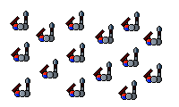
Frankly, it’s ugly as sin. The colors are HTML generic, the styling is all done in-line for testing purposes, the graphics could be a little better - should I code in multiple instances of individual soldier graphics and plug them in? They’re all based on a universal sizing template per size so it should theoretically be a thing, but I don’t know if it’d be better than using these basic png transparencies for it. Need to make sure the text can display dynamically so it’s visible on whatever size screen is looking at it, too. Do I want to set this up to be responsive from the get go or would I be better off keeping it simple at first and revising it later? Or never, and just making it for desktop? Everyone’s on phones these days, probably best to make it responsive, but it’s going to be awfule finicky to position in the first place.
As a proof of concept this is an ugly success.